
July 19, 2026
5 Free AI Website Builders Tested With the Same Landing-Page Prompt
We tested five free AI website builders with one detailed landing-page prompt, then compared the first published outputs for generic design patterns, mobile execution, SEO metadata, and free-tier residue.
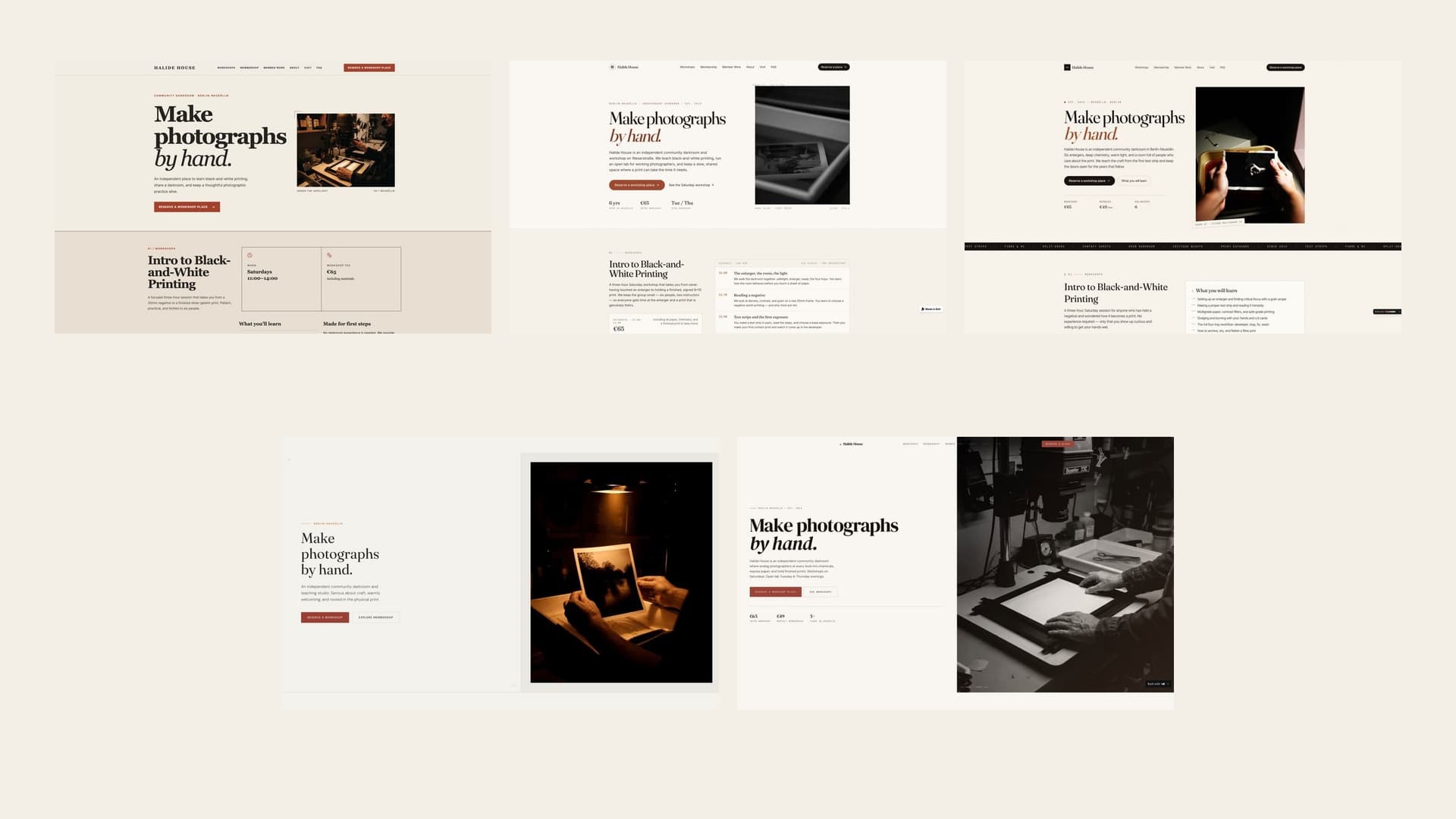
For readers comparing the best free AI website builder for landing pages, the useful question is which tool produces the least generic result on its first try. This is a first-output design benchmark, not a full buying guide covering pricing, code ownership, integrations, hosting, or maintenance. In this five-builder test, Lovable recorded the lowest generic-pattern index. Replit and v0 tied behind it, followed by Bolt and Base44. That is the answer for this prompt on this date. It is not a universal ranking of the best AI website builder.
We gave Base44, Lovable, Bolt, Replit, and v0 exactly the same detailed brief for Halide House, a fictional community darkroom in Berlin-Neukölln. Every free AI landing page builder produced a polished, usable-looking result. The more revealing finding was how often five separate tools converged on the same visual grammar: oversized serif headlines, italic accent words, warm paper colours, uppercase eyebrow labels, card grids, and repeated calls to action.
This benchmark was conducted by VibeMole, whose StyleMole scanner provides the generic-design pattern data used in the comparison.
StyleMole turns a vague AI-generated impression into repeatable visual, layout, component, and copy signals that can be reviewed across the whole page. It looks at the relationship between the opening and later sections, so an eyebrow label is only one clue among typography, cards, grids, calls to action, section rhythm, and publishing residue. That makes the pattern review more systematic and consistent than judging the hero by eye.
StyleMole does not measure search rankings, conversion, code quality, accessibility, or whether a design is beautiful. It detects recurring visual, layout, component, and copy patterns associated with generic AI-generated websites. We used that signal alongside the supplied desktop and mobile screenshots, each page’s publishing residue, and its basic title and description metadata.
AI website builder comparison: the results at a glance
Lovable’s index of 51 was the lowest in this test. Lower is better for this particular measurement. The public “checks passed” count is a separate StyleMole summary, so it should not be converted into the index or read as a percentage.
| Builder | Free-tier test | Generic-pattern index | Public StyleMole result | SEO metadata | Visible branding | Short verdict |
|---|---|---|---|---|---|---|
| Lovable | Yes, first output | 51 | 44 of 53 passed | Specific title and description | Small Lovable editing badge in the supplied capture | Least generic-pattern evidence; polished and comparatively resolved |
| Replit | Yes, first output | 57 | 40 of 53 passed | Basic title; placeholder description | Made with Replit badge | Direct hierarchy, but obvious publishing residue |
| v0 | Yes, first output | 57 | 40 of 53 passed | Specific title and description | Built with v0 badge | Strong image-led hero; repeated patterns emerge down-page |
| Bolt | Yes, first output | 75 | 37 of 53 passed | Specific title and description | Small Bolt badge in the supplied capture | Controlled first viewport, more template repetition in the long-page capture |
| Base44 | Yes, first output | 94 | 37 of 53 passed | Generic title; no description detected | Edit with Base44 badge | Confident hero, but the most cleanup required before publishing |
First free-tier landing-page output from the shared Halide House prompt
Lovable
- Free-tier test
- Yes, first output
- Generic-pattern index
- 51
- Public StyleMole result
- 44 of 53 passed
- SEO metadata
- Specific title and description
- Visible branding
- Small Lovable editing badge in the supplied capture
- Short verdict
- Least generic-pattern evidence; polished and comparatively resolved
Replit
- Free-tier test
- Yes, first output
- Generic-pattern index
- 57
- Public StyleMole result
- 40 of 53 passed
- SEO metadata
- Basic title; placeholder description
- Visible branding
- Made with Replit badge
- Short verdict
- Direct hierarchy, but obvious publishing residue
v0
- Free-tier test
- Yes, first output
- Generic-pattern index
- 57
- Public StyleMole result
- 40 of 53 passed
- SEO metadata
- Specific title and description
- Visible branding
- Built with v0 badge
- Short verdict
- Strong image-led hero; repeated patterns emerge down-page
Bolt
- Free-tier test
- Yes, first output
- Generic-pattern index
- 75
- Public StyleMole result
- 37 of 53 passed
- SEO metadata
- Specific title and description
- Visible branding
- Small Bolt badge in the supplied capture
- Short verdict
- Controlled first viewport, more template repetition in the long-page capture
Base44
- Free-tier test
- Yes, first output
- Generic-pattern index
- 94
- Public StyleMole result
- 37 of 53 passed
- SEO metadata
- Generic title; no description detected
- Visible branding
- Edit with Base44 badge
- Short verdict
- Confident hero, but the most cleanup required before publishing
Check whether your AI-built site looks generic
Run StyleMole across your full page to find recurring typography, layout, component, and copy patterns before you publish.
Example StyleMole result
Lovable: generic-pattern index 51
44 of 53 public checks passed
How we tested the free AI website builders
We ran the test on July 19, 2026. We used the free tier of each builder, supplied the same prompt, and evaluated the first generated landing page. The pages were published without a manual redesign and then scanned with VibeMole on the same date. The analysis used the supplied long-page desktop and mobile screenshots. The article displays focused excerpts for readability, and every complete capture is linked from its figure.
The prompt deliberately specified the business, content, palette, primary CTA, editorial tone, photography subject matter, responsive behaviour, accessibility, and reservation flow. That made the outputs comparable, but it also means shared colours, sections, and subject matter cannot fairly be attributed to builder sameness. The exact input is preserved below so you can judge the results against what was requested.
Read the exact shared prompt used for all five builders
Build a complete, polished single-page website now for **Halide House**, an independent community darkroom and photography workshop in Berlin-Neukölln for analog photographers, beginners, and working artists. Deliver the working site itself, not a plan, wireframe, or description. Use English copy and realistic, fully populated content that is visible on first load. The primary action throughout the page is **“Reserve a workshop place.”** Create anchor navigation for Workshops, Membership, Member Work, About, Visit, and FAQ, plus a prominent reservation action. Use the hero headline **“Make photographs by hand.”** with a concise introduction to the darkroom, a clear primary action, and an editorial analog-photography image or composition. Make the identity feel established, welcoming, and serious about craft. Include all of the following content and facts: - A workshop section centered on **Intro to Black-and-White Printing**, held **Saturdays, 11:00–14:00**, priced at **€65 including materials**. Explain what participants will learn, who it suits, what is included, and what they will leave with. - An open-lab membership section for **€49/month** that clearly explains access, equipment, shared-darkroom etiquette, and how membership supports continued practice. State that **Open Darkroom runs Tuesday and Thursday evenings**. - A populated member-work gallery with cohesive analog photographs, artist names, titles, and short captions. Use dependable builder-provided or bundled image assets so the gallery renders completely. - An instructor and community section featuring **Mara Klein, lead instructor, documentary photographer and printer**, with a credible biography, teaching approach, member testimonials, and concrete community proof such as regular critique nights or print exchanges. - Practical visit information for **Weserstraße 88, Berlin-Neukölln**, including opening times, transit or bicycle guidance in text, accessibility notes, what first-time visitors should bring, and a direct route from the visit details to the reservation action. - A concise FAQ answering realistic questions about experience level, materials, negatives, clothing, cancellations, membership, and darkroom access. - A complete footer with the Halide House name, address, key hours, navigation links, contact details, and the primary reservation action. Use at least four meaningfully different content-section layouts. For example, combine a split editorial hero, a structured workshop schedule and learning outline, a bold full-width membership band, a contact-sheet or varied gallery composition, an offset instructor profile with testimonials, a practical visit-information layout, and an accessible FAQ disclosure group. These are creative cues, not rigid templates; choose the implementation stack, exact layout, typography, and interaction details that best produce a cohesive result. The visual direction should feel editorial, tactile, and rooted in an active analog darkroom: warm off-white paper, deep charcoal, muted rust red, and restrained amber safelight accents; confident typography; subtle film grain, contact-sheet references, crop marks, and paper-like texture used with care. Balance crafted imperfection with clear hierarchy and calm reading. Photography should feel documentary and human, centered on hands, enlargers, trays, test strips, Berlin street scenes, and finished prints. Make the reservation action functional on the front end. It may open an in-page panel, dialog, or dedicated reservation section with accessible labeled fields for name, email, workshop session, and experience level, plus validation and a complete submission path: either submit directly, or review and then submit. Use client-side state only. After submission, show an unmistakable confirmation that repeats the selected workshop and session and explains that this is a demonstration; do not attempt to send data to a real backend. Support desktop, mobile-phone, and tablet views with navigation, gallery, forms, and content hierarchy adapting cleanly in each. Use semantic controls, ensure complete keyboard usability, show visible focus states, provide accessible labels and helpful validation messages, add descriptive image text, and maintain readable contrast throughout. Do not add an account or authentication gate, database, API key, live or external API integration, or external-service setup. Built-in browser capabilities and client-side state are allowed. All copy, images, schedules, testimonials, and controls must be final and populated: use no lorem ipsum or unfinished placeholders. Return a complete result at a stable preview or published URL that works on first load and needs no follow-up prompt.
What these results show and what they do not
One generation cannot represent everything an AI landing page generator can make. Models, product behaviour, and free-tier availability change regularly; another prompt or a second generation could produce a different order. This test measures the published first result, not editing quality, generation speed, credits, hosting, or long-term suitability. No user testing, conversion data, or behavioural analytics were collected.
The generic-pattern index is a weighted internal StyleMole signal: a higher number means stronger or more numerous detected patterns. The public StyleMole count reports checks passed and is a different measurement. SecurityMole, PolicyMole, and CookieMole results shown on public score pages were not used to rank these designs, and an unpassed check is not automatically a proven security or policy failure.
Lovable: the least generic first output in this test
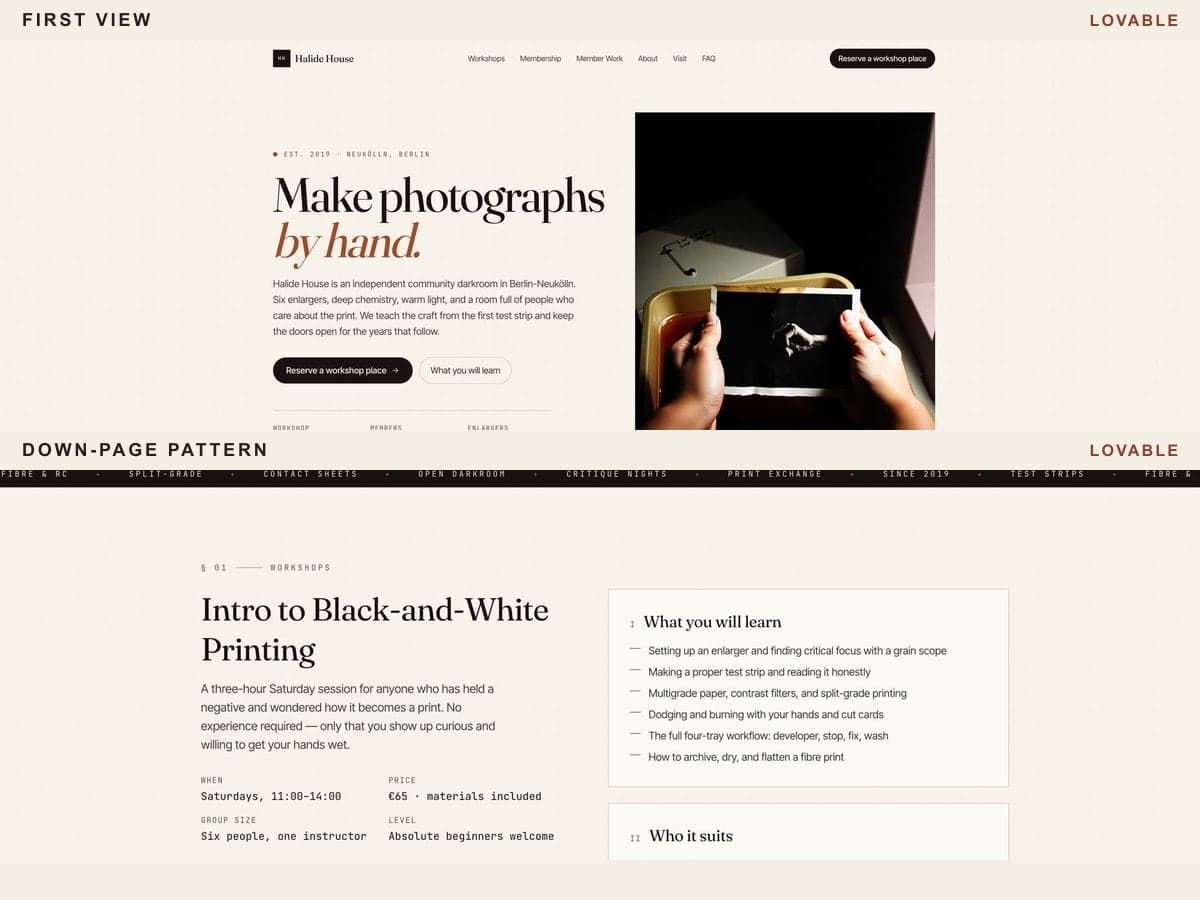
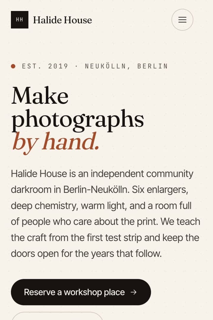
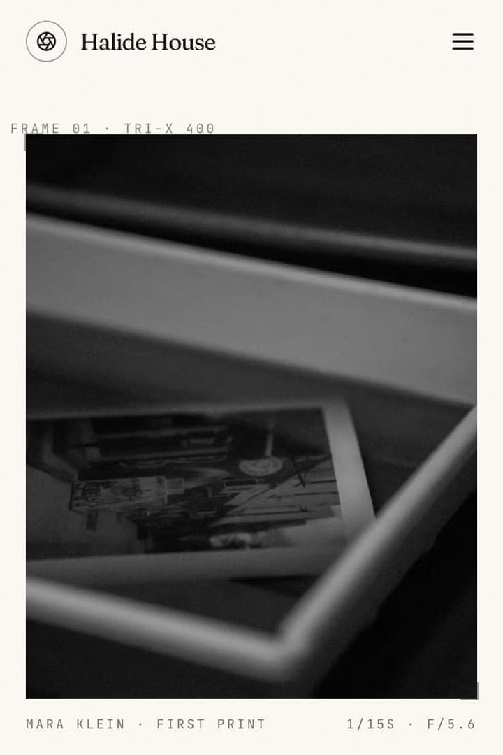
Lovable produced a balanced split hero with a compact monogram, strong serif headline, restrained facts, and a close-up photograph of hands holding a print. Farther down, a dense workshop section, dark membership band, varied four-image gallery, instructor profile, map-like visit panel, FAQ, and footer visible in the supplied capture give the page the feeling of a small cultural institution rather than a thin campaign template.
The page is not pattern-free. Italic emphasis, tiny uppercase labels, boxed learning points, repeated section geometry, and familiar CTA rhythms still place it firmly within contemporary AI-generated design. On mobile, however, the content order stays coherent: the hero facts, image, workshop details, membership offer, gallery, and instructor story stack without losing the editorial hierarchy.
Lovable recorded an index of 51 and 44 of 53 public StyleMole checks passed. Its title names Halide House as a community darkroom in Berlin-Neukölln, and its business-specific meta description was ready to refine rather than replace. A small Lovable editing badge appears in the supplied capture, but it does not dominate the layout. Verdict: the strongest starting point for this particular brief, with enough recurring AI patterns to justify a deliberate editing pass.
Replit: clear structure with visible publishing residue
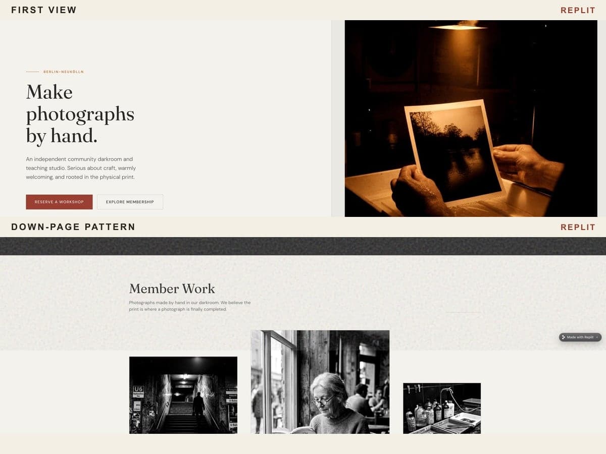
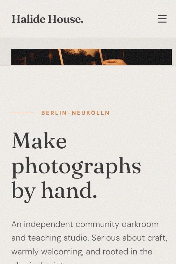
Replit’s output uses a restrained two-column opening: a short text block on the left and a large amber-lit darkroom photograph on the right. Its strongest visual moment comes later in the member-work section, where photographs of Berlin streets, a reader by a window, printing hands, and contact sheets form an uneven editorial grid. The instructor section also combines a warm working portrait with a testimonial card instead of relying only on generic feature boxes.
The familiar off-white background, red accents, outline icons, conventional visit cards, eyebrow labels, and repeated copy rhythm make the underlying template logic easy to recognise. The supplied mobile capture is content-rich and readable, but the stacked photo cards become a long sequence, and a visible “Made with Replit” badge makes the free-tier origin apparent.
Replit recorded an index of 57 and 40 of 53 public StyleMole checks passed, tying with v0. Its title is simply “Halide House.” More importantly, the meta description still identifies the site as built on Replit and includes an instruction to update the description. That untouched instruction is exactly the first-output residue to remove before launch. Verdict: a comparatively direct and photographic page that needs an immediate metadata and branding cleanup.
v0: the most image-led hero, followed by familiar rhythms
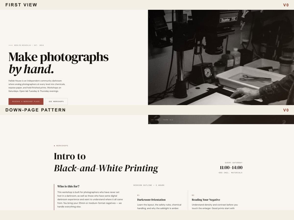
v0 gives photography the largest share of the first viewport. A full-height black-and-white darkroom image occupies the right half while the headline, introductory copy, CTA, and compact business facts sit in a spacious left column. This asymmetry and the unusually generous negative space make the opening feel more like an arts publication than a standard centred marketing page.
That distinctiveness weakens down the supplied long-page capture. The workshop schedule, three-column learning outline, black membership band, contact-sheet gallery, offset instructor biography, and testimonials repeatedly return to similar rectangular modules. The v0 desktop capture ends during the Visit section, so it does not establish how the remaining visit details, FAQ, or footer appeared. Its mobile sequence also becomes visually dense through the dark membership and gallery regions. The supplied gallery capture contains very dark panels; because that may reflect capture or loading state, we did not treat it as proof of a broken live gallery.
v0 recorded an index of 57 and 40 of 53 public StyleMole checks passed. It supplied a specific title and meta description covering the community darkroom, Berlin, audience, and Saturday workshops. A “Built with v0” badge remains visible. Verdict: the strongest hero art direction in the group, with solid metadata, but a long-page pattern score that shows why above-the-fold polish is not the whole evaluation.
Bolt: a controlled first viewport with more down-page repetition
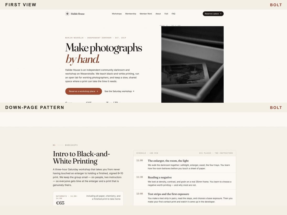
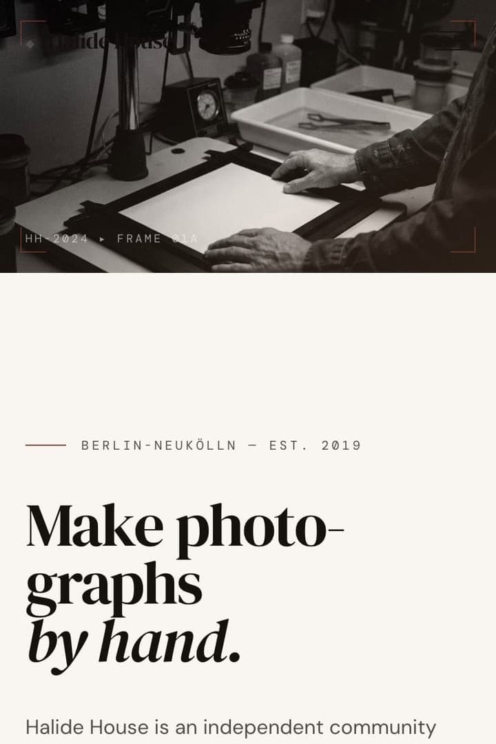
Bolt opens with a compact editorial composition: a small wordmark, ample whitespace, an italicised headline accent, three proof points, and a cropped image of a print tray. The workshop timeline is more process-oriented than a generic benefits grid, while the black membership band creates a decisive change in pace. From the first viewport alone, Bolt can look among the least conventional outputs.
The supplied long-page screenshot explains the higher scan result. Rounded information panels, stock outline icons, pills, recurring eyebrow labels, repeated CTA treatments, and similar section geometry accumulate through the membership, gallery, instructor, visit, and FAQ regions visible in the capture. Its mobile version makes the workshop timeline especially legible, but the same boxed rhythm becomes more prominent as every module stacks. The supplied gallery screenshot contains blurred-looking panels; we treat that as a capture observation, not a confirmed live-site failure.
Bolt recorded an index of 75 and 37 of 53 public StyleMole checks passed. Its business-specific title and meta description are strong first-output SEO foundations. A small Bolt badge is visible in the supplied capture. Verdict: polished and restrained at the top, but the largest gap alongside Base44 between the first impression and patterns detected across the captured page.
Base44: an attractive hero with the most cleanup required
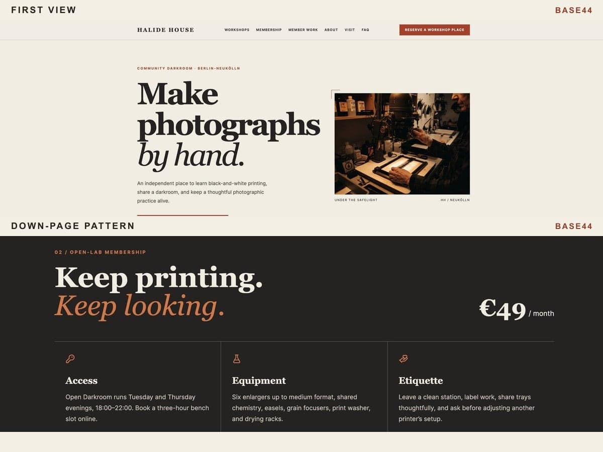
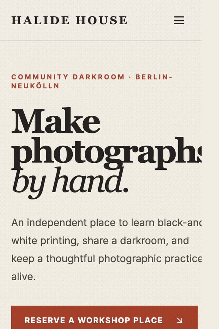
Base44’s first viewport is confident: a large serif headline, italic “by hand” accent, rust CTA, and warm darkroom image sit in an orderly editorial grid. Its gallery in the supplied capture renders as a varied arrangement of street, portrait, contact-sheet, and canal photographs. The instructor section has a credible documentary tone, and the strong black membership block gives the long page useful contrast.
Across the page, however, the same visual devices recur often. Small uppercase eyebrow labels, Lucide-style icons, outlined cards, accent-treated headings, uniform information grids, and numerous repetitions of “Reserve a workshop place” make the system feel generated rather than edited. The mobile capture intensifies that repetition because every card, icon, and CTA appears in one continuous column. The visible “Edit with Base44” badge adds another piece of free-tier residue.
Base44 recorded the highest index, 94, while 37 of 53 public StyleMole checks passed. Its page title was the generic “Base44 APP,” and no meta description was detected. Those are material SEO basics, even though the hero itself looks polished. Verdict: a visually credible first draft that needs the most editing in this comparison, especially metadata, CTA variety, component repetition, and builder branding.
How the five AI-generated landing pages compare on mobile
The supplied mobile screenshots show each builder reaching the workshop, membership, gallery, and instructor content at different depths. All five mobile captures hit the 16,384px capture limit, so none proves the final page ending or retention of every requested section. They remain useful for comparing how repeated card systems that look compact on desktop become more obvious when stacked; each supplied capture is linked below for closer inspection.
Category verdicts: which builder was strongest where?
These verdicts answer narrower questions than “Which is the best AI website builder?” That broader choice also depends on editing workflow, code ownership, integrations, hosting, price, and future maintenance. This landing-page output test did not measure any of those factors.
- Least generic first output: Lovable, with the lowest generic-pattern index at 51 and the highest public StyleMole pass count in this group.
- Strongest first-output SEO metadata: Lovable, Bolt, and v0 all supplied specific titles and descriptions. Replit left a placeholder description; Base44 used a generic title and had no detected description.
- Most image-led hero: v0, whose black-and-white darkroom photograph occupies half of the desktop first viewport.
- Most visible free-tier residue: Base44, Replit, and v0 each leave clearly identifiable platform branding; the supplied Bolt and Lovable captures also contain smaller badges.
- Most editing required before publishing: Base44, based on its metadata gaps, highest index, repeated CTA system, and accumulated card patterns.
- Strongest hero-versus-long-page mismatch: Base44 and Bolt. Both open with controlled editorial compositions before repetition becomes more apparent down-page.
How to make an AI-generated website look less AI-generated
Treat the first generation as a structured draft. The fastest improvements come from removing residue and making the design respond to the actual business rather than adding more decoration.
StyleMole focuses on design-pattern evidence across the page. CookieMole, PolicyMole, and SecurityMole cover separate launch-readiness areas, including consent, public policy coverage, and basic security signals. Together, the VibeMole suite gives you a broader and more repeatable review before launch. VibeMole does not replace expert review from legal, security, accessibility, or conversion specialists.
For a broader pre-publication pass, use the vibe coding launch checklist. It covers the privacy, tracking, security, upload, and deployment questions that a visual landing-page review cannot answer.
- Rewrite the page title and meta description around the real offer, audience, and location; remove every generated instruction or placeholder.
- Verify addresses, phone numbers, email addresses, dates, prices, schedules, testimonials, and claims before publishing.
- Replace decorative stock icons with business-specific photography, diagrams, labels, or nothing at all.
- Break the repeated-card rhythm: let a schedule be a schedule, a testimonial be a quotation, and a visit section read like practical directions.
- Reduce eyebrow labels, oversized headlines, pills, gradients, and italic accent words unless each has a clear editorial purpose.
- Vary CTA wording by intent. Let people compare sessions, see membership access, or plan a visit while keeping one clear primary conversion action.
- Check contrast, body-text size, line length, keyboard focus, form errors, navigation, and image descriptions on phone, tablet, and desktop.
- Review the long-page result, not only the hero. Repetition and weak publishing details often appear below the fold.
- Remove builder branding where the chosen plan permits it, then run a final metadata and launch-readiness check.
The takeaway for choosing a free AI landing page builder
Lovable produced the least generic first draft in this particular test, but none of the five outputs was ready to publish without review. Replit and v0 were close on the pattern signal for very different visual reasons; Bolt demonstrated how a restrained hero can mask down-page repetition; and Base44 showed that an attractive first viewport can coexist with weak metadata and a high concentration of familiar patterns.
The most effective workflow is to use an AI website builder for speed, then deliberately remove repeated AI patterns, check metadata, inspect mobile, and verify every business detail. That process matters more than treating one first-generation result as a permanent platform ranking.
Built a landing page with an AI website builder? Scan it with VibeMole. StyleMole reviews recurring typography, layout, component, and copy signals across the whole page, while the rest of the VibeMole suite checks separate launch-readiness areas that are easy to miss before publishing.
FAQ
Which free AI website builder made the least generic landing page?
Lovable recorded the lowest generic-pattern index in this test at 51, followed by Replit and v0 at 57. This reflects one first-generation landing page from one shared prompt on July 19, 2026, not a universal platform ranking.
What does the VibeMole generic-pattern index measure?
It is a weighted signal based on recurring visual, layout, component, and copywriting patterns associated with generic AI-generated websites. Lower is better for this particular measurement. It is not a percentage and does not measure Google rankings, conversion, usability, accessibility, security, or code quality.
Does Google penalise websites for looking AI-generated?
Google’s current guidance for generative AI content focuses on accuracy, quality, relevance, original value, and spam policies. It does not describe a special visual-style penalty for “vibe-coded” websites. Generic design can still be less effective when it comes with weak metadata, placeholder copy, poor readability, repetition, or low user trust, so those concrete issues are worth fixing.
How can I improve the first page from an AI website builder?
Start by replacing generic metadata and placeholder text, verifying every business fact, reducing repeated cards and eyebrow labels, varying calls to action, checking mobile readability and keyboard use, and reviewing the full page rather than only the hero. Treat the first generation as a draft.
Sources
- Lovable Halide House live page
- Lovable public VibeMole score
- Replit Halide House live page
- Replit public VibeMole score
- v0 Halide House live page
- v0 public VibeMole score
- Bolt Halide House live page
- Bolt public VibeMole score
- Base44 Halide House live page
- Base44 public VibeMole score
- Google Search guidance for generative AI content