
July 1, 2026
How to Avoid Building Apps That Look Vibe Coded
Your app can work perfectly and still look like it came from the same AI prompt as everyone else's. Here are the common StyleMole signals that make products feel vibe coded, and how to fix them before real users judge the page.
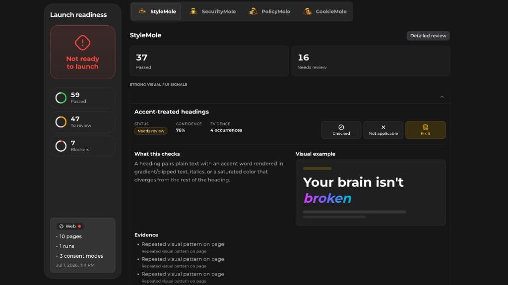
Vibe coding is not the problem.
The problem is shipping the first design your AI tool gives you.
A lot of AI built apps have the same surface: dark hero section, purple gradient, pill badge, oversized headline, three feature cards, rounded glass panels, vague copy, and a pricing section that looks like it was copied from every SaaS landing page since 2023.
The app may work. The idea may be useful. The founder may have spent real time on it.
But users do not see your effort. They see the page.
And if the page looks like a default AI output, they may assume the product behind it is also generic, rushed, or unfinished.
That is what StyleMole is built to catch.
StyleMole does not try to guess whether a human or AI wrote your website. It checks for repeated visual, wording, structure, source, and package patterns that make a product feel generic, template heavy, or unfinished.
This guide explains the most common signals and how to avoid them.
What does "vibe coded" actually look like?
A vibe coded app usually does not look bad in one obvious way.
That is why the problem is annoying.
The page often looks polished at first glance. It has gradients, cards, icons, animations, rounded corners, nice spacing, and modern fonts. The issue is that everything feels familiar in the wrong way.
The design says: "I have seen this exact app before."
That feeling usually comes from a stack of small defaults.
One default is harmless. Ten defaults together create the vibe coded look.
1. Cards inside cards inside cards
This is one of the clearest signals.
A hero card contains a dashboard card. Inside that dashboard card are stat cards. Inside those cards are icon tiles, badges, small pills, and little progress bars.
It creates visual noise without adding much meaning.
Common pattern:
- Outer rounded container
- Inner glass panel
- Three feature cards
- Icon in a small square
- Short heading
- Two lines of vague text
- Colored border or glow
The fix is not to remove all cards. Cards are useful. The fix is to make each card earn its place.
Ask: Does this container group related information? Would the section be clearer without the extra wrapper? Is the card showing real product evidence or just decoration?
A good SaaS page does not need to prove it is modern with another rounded rectangle.
2. The same feature grid everyone uses
The default AI SaaS layout usually looks like this: Hero. Logo row. Six feature cards. How it works. Testimonials. Pricing. FAQ.
That structure can work, but it becomes forgettable when every section uses the same rhythm.
The biggest issue is not the layout itself. It is the lack of hierarchy.
Every feature card has the same size. Every icon has the same weight. Every headline sounds equally important. Nothing tells the visitor what matters most.
Better approach:
- Make the most important feature visually dominant.
- Show one real workflow instead of six abstract benefits.
- Use screenshots, reports, examples, or product evidence.
- Replace "feature grid" thinking with "user problem" thinking.
For VibeMole, for example, the stronger story is not: "Three powerful modules for modern founders."
The stronger story is: "Scan your website, find the issue, copy the fix prompt, re-scan."
That is specific. It shows a workflow. It feels more real.
3. Purple gradients and glowing blobs by default
Purple gradients are not automatically bad.
The issue is that AI generated SaaS pages overuse them as a shortcut for "modern", "AI", "premium", or "future".
When a page has a purple glow behind the hero, gradient text in the headline, glowing cards, blurred orbs, and neon borders, the product starts to look like a template.
The fix is constraint.
Pick one visual signature and make it intentional.
- One accent color, not five.
- One gradient use case, not every section.
- One strong hero visual, not random abstract decoration.
- Product screenshots over floating blobs where possible.
If your product is about trust, audits, compliance, launch readiness, or serious SaaS checks, too much glow can work against you.
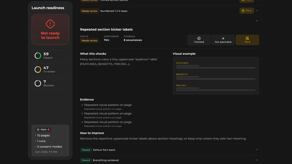
4. Pill badge spam
Pill badges are everywhere: "AI powered." "Built for founders." "Launch faster." "No code required." "Privacy first." "Beta." "New." "Trusted by builders."
One or two badges can help orientation. Too many make the page feel auto-generated.
The common vibe coded pattern is a small eyebrow badge above every section heading.
After a while, the visitor stops reading them.
Better:
- Use badges only when they add real information.
- Replace generic badges with specific proof.
- Avoid repeating the same badge pattern in every section.
- Do not use badges as decoration.
A badge that says "CLI scan available" is useful.
A badge that says "Powerful insights" is filler.
5. Generic SaaS copy
This is often worse than the visual design.
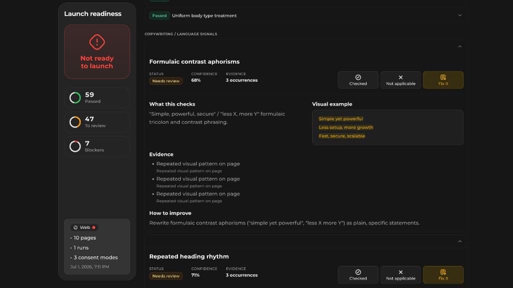
Vibe coded apps tend to use the same language: Effortless. Seamless. Powerful. Supercharge. Unlock. Streamline. Transform your workflow. Built for modern teams. Everything you need. Save time and focus on what matters.
The problem is not that these words are forbidden. The problem is that they do not tell the user anything.
Bad: "Unlock powerful insights for your website."
Better: "Find repeated UI patterns, generic SaaS copy, and design defaults that make your website look vibe coded."
Bad: "Ship with confidence."
Better: "Scan your website or local project before real users judge the page."
Specific language beats polished language.
6. Repeated section headings
Another common signal is repeated heading structure.
Examples: "Everything you need to…" "Built for…" "Designed for…" "Powerful features for…" "Simple, fast, reliable…" "From X to Y in minutes…"
Again, none of these are always wrong. The issue is repetition.
If every section uses the same sentence shape, the page starts to feel generated.
A quick test: Read only your H2 headings out loud. If they sound like they could belong to any SaaS product, they need work.
Better headings should name the actual product behavior.
For StyleMole, a generic heading would be: "Design insights for modern builders."
A stronger heading would be: "Find the patterns that make your app look like default AI output."
7. Default font stacks and flat typography
A lot of AI generated apps use the same default font choices, usually clean sans-serif stacks with very little typographic personality.
That is not always a problem. Default fonts can be good.
The issue is flat hierarchy.
Everything looks equally smooth. Headlines, cards, buttons, labels, and body text all feel like they came from the same component library with no extra direction.
Fix this by defining a simple type system:
- One clear H1 style.
- One clear H2 style.
- Smaller body text that is actually readable.
- Labels and captions that do not compete with headings.
- Fewer font weights.
- More intentional contrast between content levels.
You do not need a fancy font. You need hierarchy.
8. Lucide icon grids everywhere
Lucide icons are useful. So are other popular icon sets.
The issue is when every feature card uses the same icon style, same square background, same heading length, and same two-line description.
That pattern screams generated component grid.
Better:
- Use icons only where they clarify the concept.
- Mix icons with real UI screenshots or concrete examples.
- Avoid using icons as a replacement for product evidence.
- Make one feature visual stronger instead of making six equal icon boxes.
A real screenshot of a StyleMole finding is more convincing than another sparkle icon.
9. One-sided colored borders
A common AI design trick is the card with a colored border on one side.
It can look nice. It can also become a recognizable default.
You see it in feature cards, alert cards, pricing cards, testimonial cards, and dashboard mockups.
Use it carefully.
If every important item gets the same colored strip, nothing feels important anymore.
Better:
- Reserve colored borders for status, severity, or category.
- Use them consistently with meaning.
- Avoid adding a colored strip just because the section feels empty.
For example, StyleMole could use color meaningfully to show severity: repeated pattern, visual overload, wording issue, source clue, package signal.
That is better than decoration.
10. Dark mode SaaS with no product context
Dark mode can look good.
But many vibe coded apps use dark mode because it hides weak structure. Add a gradient, a glow, and glass cards, and the page feels finished even when the content is vague.
The problem appears when the page looks dramatic but does not explain the product.
A serious product page should quickly answer:
- What does this do?
- Who is it for?
- What do I enter?
- What do I get back?
- What happens after the scan?
- Why should I trust the result?
If the page cannot answer those questions without the glow, the design is carrying too much weight.
11. Fake product evidence
A lot of AI generated landing pages include fake dashboards, fake testimonials, fake metrics, fake logos, and fake "trusted by" sections.
This damages trust.
If you are early, say less and show more.
Better options:
- Show a real report screenshot.
- Show an example finding.
- Show a before and after.
- Show a real checklist.
- Show a sample fix prompt.
- Show what the CLI sees that the web scan cannot.
For StyleMole, the evidence should be simple: "Here is the signal. Here is why it makes the page feel generic. Here is the fix prompt."
That is more useful than a fake dashboard chart.
12. Repetitive animation and flashing dots
Flashing status dots, pulsing badges, scanning animations, loading bars, animated borders, and moving gradients can quickly make a page feel less serious.
Motion should explain state or guide attention. It should not be there just to prove the site is alive.
Good motion:
- Shows that a scan is running.
- Highlights the exact issue on the page.
- Reveals a finding after analysis.
- Helps users understand progress.
Weak motion
- Pulsing dot next to every label.
- Infinite glow on every card.
- Moving gradient behind static copy.
- Animated border around a normal button.
Use motion like product feedback, not decoration.
13. Copy that sounds confident but says nothing
AI generated SaaS copy often has a strange confidence problem.
It sounds polished, but it avoids specifics.
Example: "Get actionable insights to improve your digital experience."
That could describe analytics, SEO, heatmaps, accessibility, design audits, compliance, or customer support.
Better: "StyleMole checks visual patterns, wording patterns, UI structure, source clues, and package signals that can make your website feel generic, template heavy, or unfinished."
That sentence is longer, but it actually says something.
The rule: If your sentence could fit 500 other SaaS products, rewrite it.
14. No visible product workflow
A lot of AI built apps have a landing page that explains benefits but not usage.
That creates a trust gap.
People want to know what actually happens.
For StyleMole, the workflow should be visible:
- Enter a public URL or run the [CLI scan](/#web-scan-vs-cli) on a local project.
- StyleMole scans for repeated design and wording patterns.
- The report shows the signals with evidence.
- You copy an AI-ready fix prompt into Cursor, Claude Code, Copilot, or your preferred tool.
- You fix the issue and re-scan.
That is much stronger than saying: "Improve your design with AI powered recommendations."
15. The product looks like the tools used to build it
This is where source and package signals matter.
Sometimes the rendered page looks generic because the codebase is full of defaults:
- Unmodified component library patterns
- Repeated scaffolded sections
- Same card component everywhere
- Default spacing scales used without design decisions
- Overused animation packages
- Common landing page templates
- Generic icon imports across every section
- Repeated shadcn-style layouts without customization
A browser scan can see the page. A CLI scan can go deeper.
That is why StyleMole should be useful in both modes. The web scan can inspect the rendered result. The CLI scan can inspect the project structure, dependencies, repeated components, package clues, and local implementation patterns.
The best signal is not "this uses shadcn" or "this uses Lucide".
Good tools are not the issue.
The issue is when everything still looks like the default output from those tools.
How to make your app look less vibe coded
You do not need to redesign everything from scratch.
Start with five practical changes.
1. Replace vague copy with product-specific copy
Do not say: "Transform your workflow."
Say what your product actually checks, generates, blocks, fixes, scans, sends, imports, exports, compares, or warns about.
Specific verbs make the product feel real.
2. Remove one layer from every section
If a section has a background, a container, a card, an inner card, icon boxes, badges, and borders, remove at least one layer.
Most AI generated pages are over-wrapped.
Cleaner structure usually feels more confident.
3. Make one thing visually dominant
Do not give every feature equal weight.
Pick the feature that best explains the product and give it more space.
For StyleMole, that might be the report finding itself: signal detected, evidence, why it matters, fix prompt.
That is the product. Show it.
4. Add real product evidence
Screenshots, scan examples, checklists, issue explanations, and fix prompts are stronger than abstract graphics.
If you do not have customer logos, do not fake the feeling of having them.
Show the product doing the job.
5. Give your AI tool stricter design constraints
When prompting for UI, do not only say: "Make it modern and clean."
That usually creates the same modern clean SaaS page.
Use constraints:
- Avoid purple gradients unless they match the brand.
- Avoid nested cards.
- Avoid generic feature grids.
- Avoid glassmorphism.
- Avoid vague SaaS wording.
- Avoid repeating the same section structure.
- Use real product screenshots where possible.
- Prioritize clarity over decoration.
AI tools are better when you force them away from the average.
A practical prompt to improve a vibe coded page
Use this after you already have a first version:
Review this landing page like a senior product designer.
Goal: Make it feel more specific, trustworthy, and less like a default AI generated SaaS page.
Look for: nested cards and unnecessary wrappers; purple gradients, glowing blobs, and glassmorphism used as decoration; repeated feature grids; generic SaaS copy; weak visual hierarchy; repeated badges and eyebrow labels; default-looking icon cards; fake or vague product evidence; headings that could apply to any SaaS product; missing explanation of the actual product workflow.
For each issue: explain why it makes the page feel generic; suggest a concrete replacement; rewrite the affected copy where needed; prefer fewer components, more product evidence, and clearer hierarchy.
That prompt helps, but it still depends on what you notice and what you paste into the AI tool.
That is where StyleMole comes in.
How StyleMole helps
StyleMole is part of VibeMole.
It checks the patterns that can make a website feel vibecoded, generic, template heavy, or visually unfinished.
It is not an AI detector. It does not say: "This was made by AI."
It asks a more useful question: "Would a real visitor land here and think this looks like default AI output?"
StyleMole looks for signals across:
- Visual patterns
- Wording patterns
- UI structure
- Source clues
- Package signals
- Repeated component patterns
The goal is not to shame AI builders. The goal is to help them ship something that feels more intentional.
A StyleMole report can show issues like: nested card overload; repeated SaaS section patterns; overused badges; generic feature copy; default component sameness; weak visual hierarchy; glassmorphism overuse; gradient text overload; repeated icon card grids; CLI-detected scaffold or package patterns.
Where available, findings can include an AI-ready fix prompt so you can move directly from issue to improvement.
The workflow is simple: Scan your website. Find the issue. Copy the fix prompt. Let your AI tool fix it. Re-scan.
Vibe coding is fast. Design still needs intent.
AI tools are good at producing a plausible first version. That is also the trap.
Plausible is not the same as trustworthy. Polished is not the same as specific. Modern is not the same as memorable.
If you are building with Cursor, Claude Code, Copilot, Lovable, Bolt, v0, Replit, or any other AI builder, you do not need to hide that.
But you should avoid shipping the default aesthetic untouched.
Your app should look like your product. Not like the average of every SaaS landing page the model has seen.
StyleMole helps you catch those defaults before your users do.
For launch readiness beyond design, VibeMole also includes CookieMole for cookies and consent, PolicyMole for privacy policy coverage, and SecurityMole for common security risks before you ship.
FAQ
What does it mean if an app looks vibe coded?
It usually means the app looks like a default AI generated SaaS output. Common signs include nested cards, purple gradients, glass panels, generic feature grids, vague copy, repeated badges, and weak visual hierarchy.
Is using AI to build an app bad?
No. The issue is not using AI. The issue is shipping the first generic version without adding product-specific design, copy, structure, and evidence.
Can a good app still look vibe coded?
Yes. The product can work well while the landing page still feels generic. Users often judge quality before they try the app, so the visual and copy signals matter.
How do I make my AI generated app look more original?
Use stricter design constraints, remove unnecessary wrappers, replace vague SaaS copy with product-specific language, show real product evidence, and avoid repeating the same card and badge patterns across every section.
What does StyleMole check?
StyleMole checks visual patterns, wording patterns, UI structure, source clues, and package signals that can make a website feel generic, template heavy, or unfinished.
Is StyleMole an AI detector?
No. StyleMole does not try to prove whether AI built a website. It checks whether the page contains patterns that make visitors think it looks like default AI output.
Can StyleMole scan a live website?
Yes. StyleMole is designed to scan public URLs as part of VibeMole's web scan flow.
Can StyleMole scan a local project?
The CLI mode is designed for deeper local checks, including source and package signals that a public web scan may not be able to see.